
Figma Notes - Build once with variables for color modes and dimension
Figma variables make dark mode and sizing so much easier.
As a side project, I've been playing with Figma variables to make creation of a set of dark mode designs as easy as option (alt)-dragging a design or set of light mode designs to a container/section/frame that has been set to dark mode. There is a time hit when making and refining the light/dark mode variables, but once you do, the payoff is more than worth it. This was demoed at the release of the beta for Figma variables and it's a game changer.
Figma variables launch demo
Fast dark mode
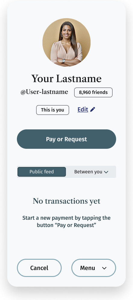
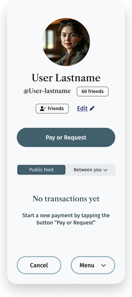
If you don't want to watch the video, the gist is that you can create a design in light mode (or dark if that's your default color mode; light shown here):
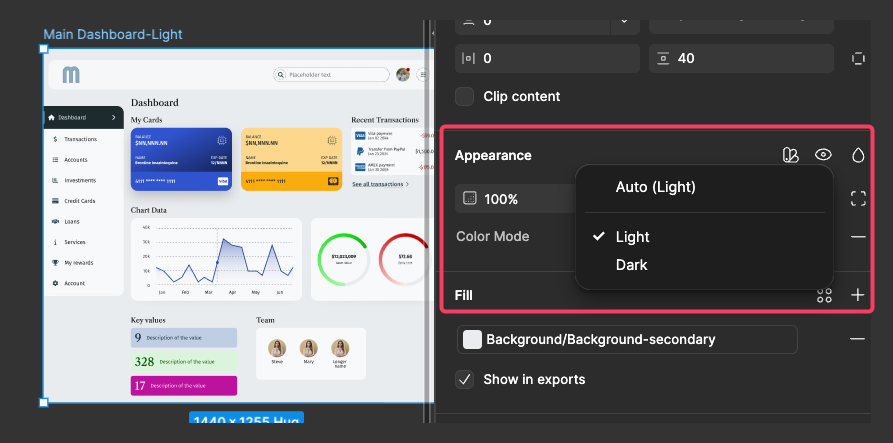
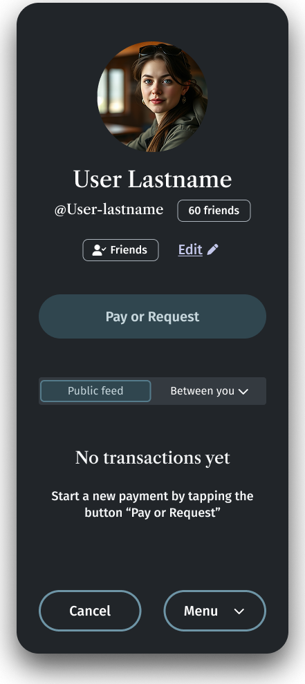
Then duplicate it and while keeping it selected, set the container frame to dark mode:
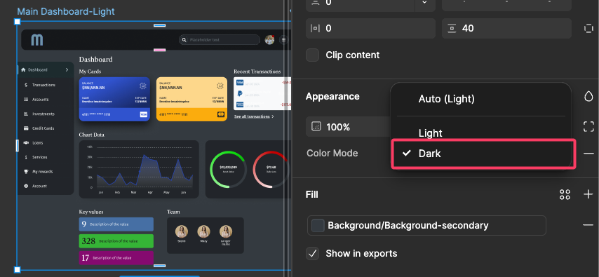
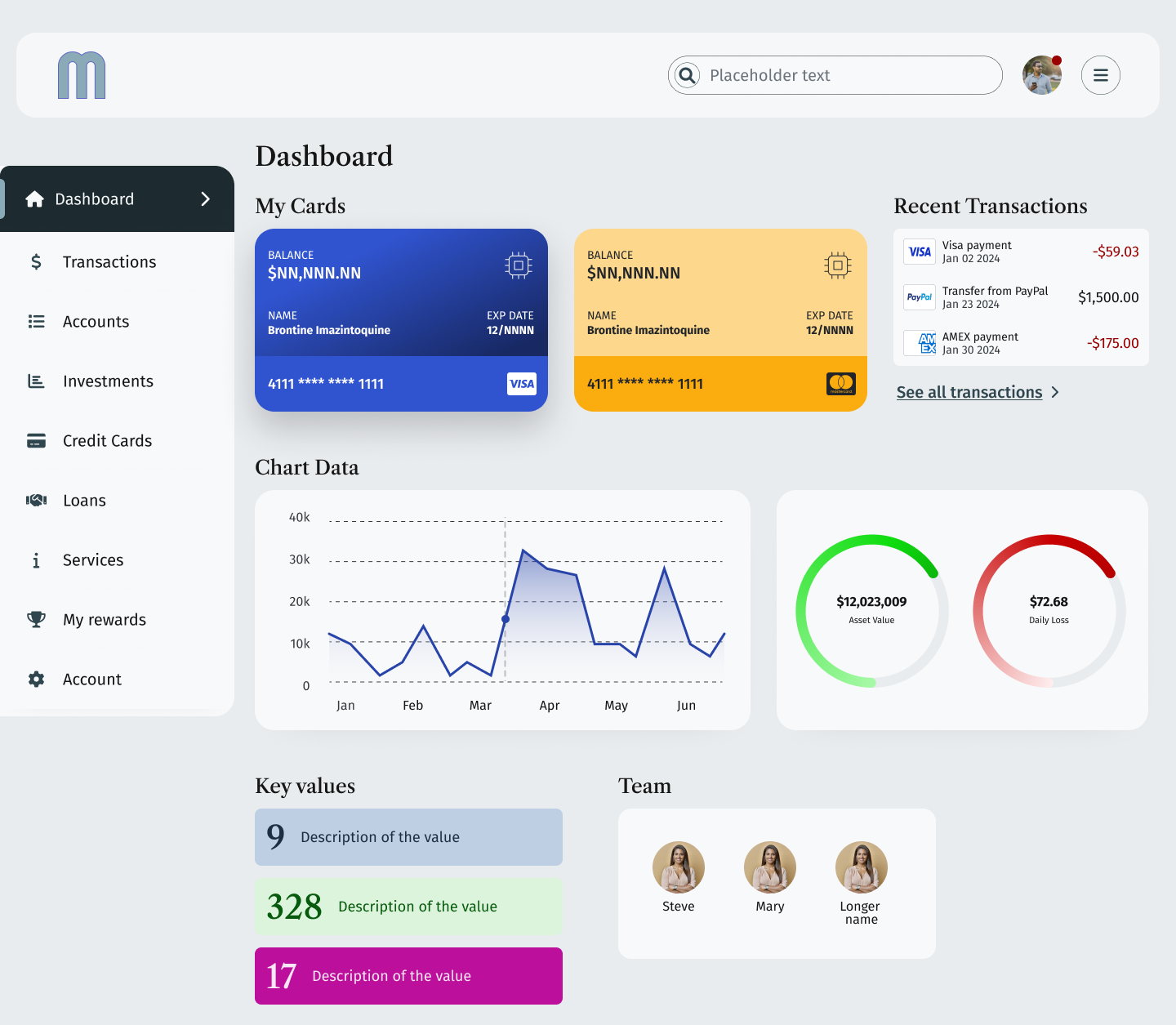
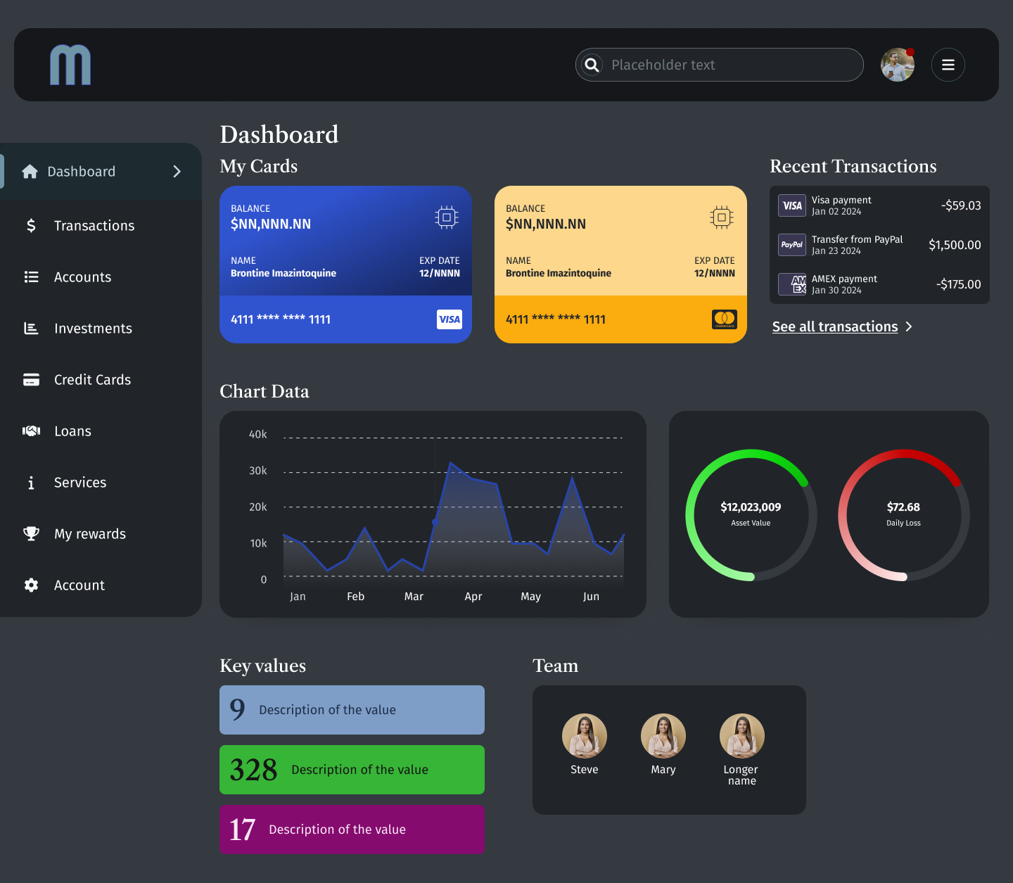
Nice. Testing dark mode variables like this is hugely helpful. You can see where the dark variables need to be tweaked (or not) and take care of it on actual design. Here's the full sized version of the dashboard in dark mode:
It does mean some tweaking in the early iterations, but the results are worth it, especially for stakeholder buy-in and dev handoff.
Complex screens
Another example of just how much time can be saved using variables: pages with complex design. Here's a screen with detailed tabular information, nested components, icon navigation on the left side, a segmented group selector and pagination:
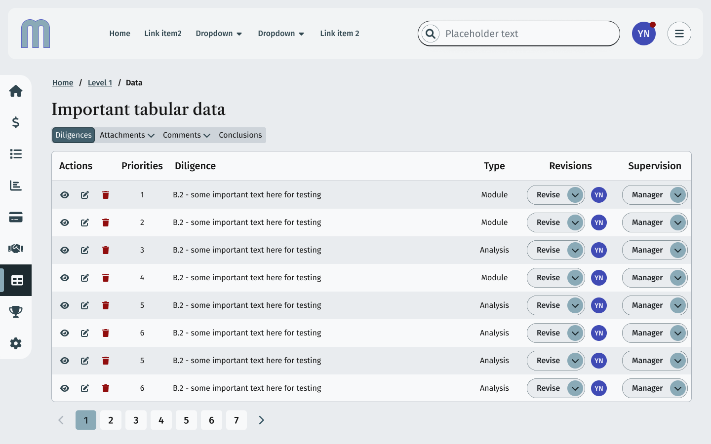
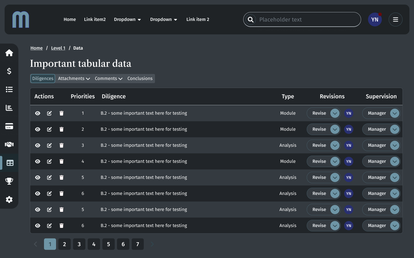
Making colors in dark mode is counter intuitive at times, but having variables in a mode table makes testing and committing so much faster than custom, hand-built dark mode.
Protoyping speed
Using variables for color modes can produce speedier prototyping. Here's a Figma prototype window showing a demo of a light mode dropdown overlay being displayed in a dark mode parent frame as an overlay:
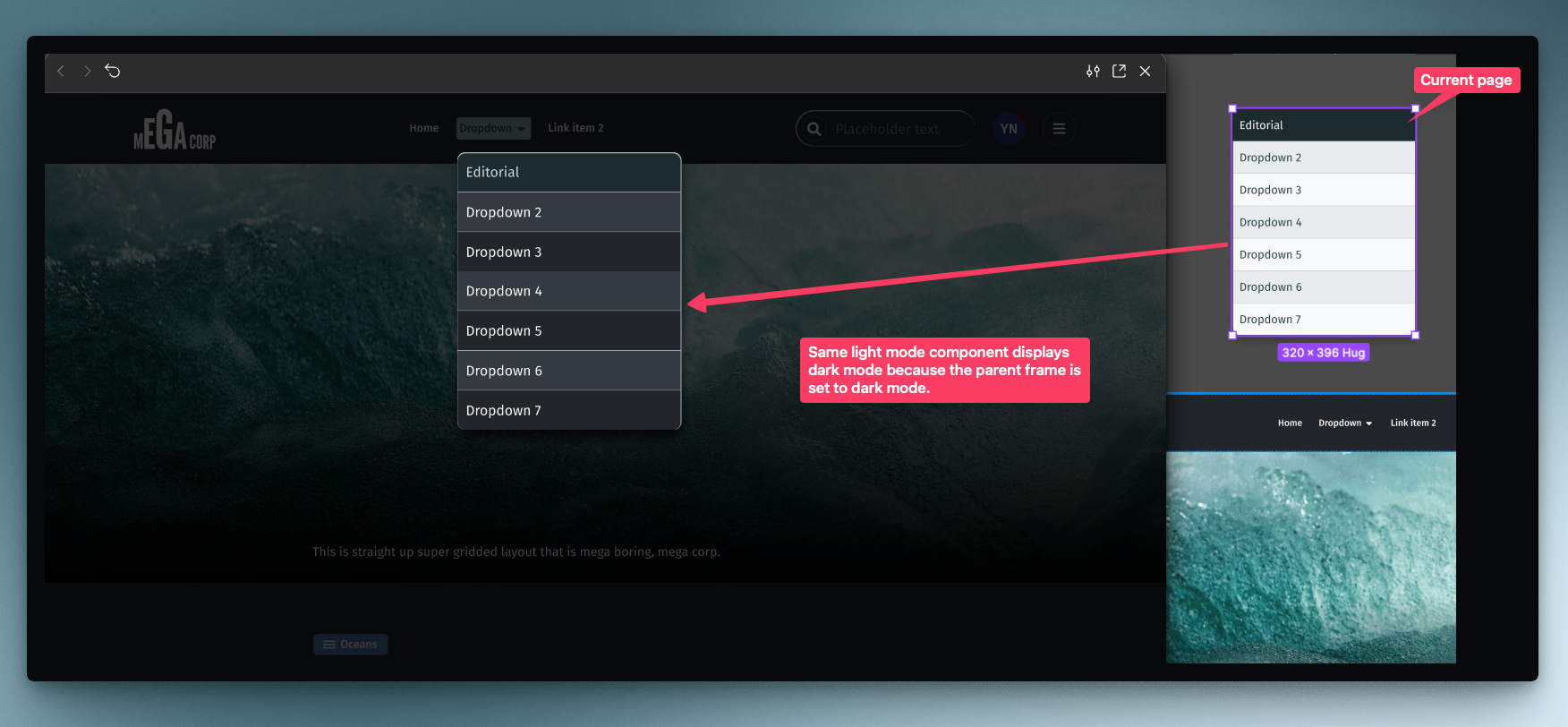
Creating a single set of elements/components in one mode and being able to use those in another mode means fewer tedious build outs. Easier to get user feedback on dark mode choices as well.
While not a catch all for making dark mode "easy", variables definitely helps getting to usable dark mode designs more quickly.
Dimension, spacing and sizing using variables
The use case for using variables to quickly change the size of components might be something like a set of consumer facing designs with one set of spacing and a "professional" or "admin" set of designs with tighter spacing and smaller components. Instead of building all of that out by hand, make a set of sizing primitives and then build out spacing modes. When creating your components, apply the spacing mode base/default to elements such as padding, space-between and border radius. Once you have done this do a published component, you can set sizing mode on a parent frame and quickly build out different spacing modes for testing, stakeholder signify and dev handoff.
Primitives & setup
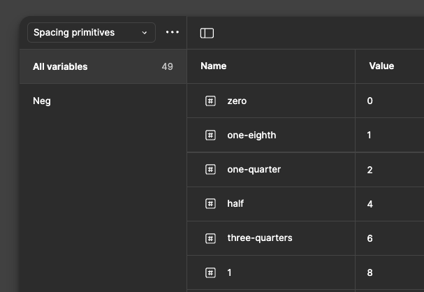
Numerical variables can be deceptive at first. But since we are talking about a systemic approach, we will use what Figma recommends by creating a set of primitive spacing variables. These consist of a name and a value. Spacing should align to an 8pt grid for design elements and a 4pt baseline for text.
I started with the values I wanted the primitives to have: 0, 2, 4, 6, 8, 10, 12, 14, 16, 18, 20, 24, 32, etc. Each of those is an even number. This isn't necessary, but for my purposes, using even numbers is easier to track in terms of naming convention.
One challenge are sizes that can result in odd fractions such as 14 and 18, 14 is commonly used for smaller font sizes and 18 for default font size. 18 might be used for line-heights depending on font family used.
In order to set up primitives based on an 8pt grid, I used text values to describe the variable in relation to 8. For 0 I used "zero". For 2 I used "one-eighth" and for 4 "one-half". You can see this in context in the screenshot below:
I also made a set of negative primitives duplicating the exact same structure as the positive variables for those times where a negative spacing is needed. This works surprisingly well and translates into our spacing modes easily.
For this example, the default would be 1x. After playing around with a 2x, based on the primitives and visual weight, 3x and 4x give greater result and would work better for super large viewports. One request that I've seen is to "reduce the whitespace" in contemporary consumer interfaces for more data dense screens. So a .75x spacing mode is an affordance for smaller, tighter designs if the design system components are truly global or meant for all potential client uses.
Units and a tiny bit of math
If 8 = 1 spacing unit, then I can name the units with fractions and build out my spacing mode table for 1x, .75x, 3x and 4x. This collection of modal variables will refer to the spacing primitives table of numerical variables and nest those inside of each of the columns:
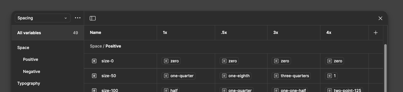
I gave my positive spacing names of "size-" and a value starting at zero and moving up similar to how Google's Material has used 0-1000 as a way to indicate an increase in value. The negative spacing has the exact same values, just using the negative primitives in place of the positive primitives.
By doing it this way, the variable structure is easy to edit and tweak if there isn't enough variance between size modes, e.g. I need 14 and 18 as values for typography. The system design allowed me to quickly add in those primitive values and then apply those to typography variables. It also means there is a simple set of variables to apply rather than strictly enforcing something like border-radius of a given component and that component having custom border radii. Certainly, there are times to make individual component border-radii and use the same primitive set, but for our purposes, overkill to demo the concept of spacing variables.
In the examples below, I've created the base or default components, using the size mode, 1x.
I used the spacing variables for padding, border radius, space-between and font-size. Here is an example of the size modes using a Select Chip component:
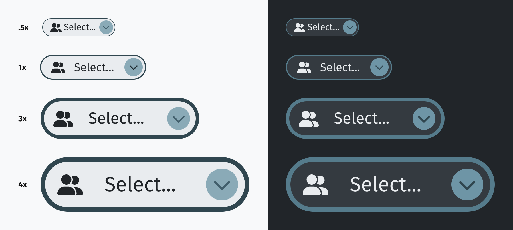
Even the border width scales up/down.
I only designed the 1x version. The others just leverage the variable modes of the size multipliers .75x, 3x and 4x. Build once, and if the variables are properly applied, you have three more size possibilities as well as a dark mode without having to design each one.
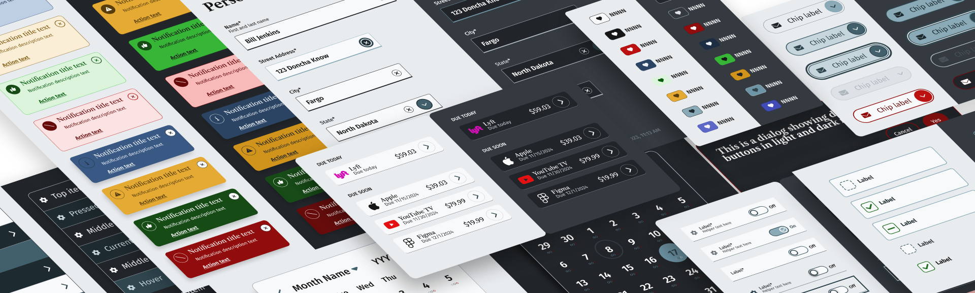
Gallery

Conclusion
If it's not clear already, being able to build one component and use it across dark and light modes as well as applying different spacing constraints reduces the amount of overall component variants needed when publishing components to a library.
If you have questions, or want to reach out, send a message to:
jon@jonarmstrong.me