Learning key pricing structure for a new concierge service
Workshop, design, prototype and user testing to understand consumers willingness to pay extra for a new delivery service
Toys ‘R Us / Babies ‘R Us
Skills:
Design sprint
Interaction design
Mobile prototyping
User testing, guerrilla style
User research
Tools:
Sketch
Axure
Screenflow (screen recording),
Capture laptop
Mobile phone
Background
When customers ordered furniture or other large items they were shipped via freight and dropped off at the curb. No door knock, no indication that anything had been dropped off. Shipping via freight is very inexpensive, but doesn’t factor in how customers live. This shipping method was causing customer service issues such as breakage, weather damage, and theft.
Senior stakeholders wanted to provide a white glove service for customers who purchased furniture, but were concerned that the value shoppers wouldn’t be willing to pay extra for the service. They were having difficulty landing on tiers of service and pricing for each tier. A new product owner suggested a design sprint and as a consultant, I was invited to attend and be the UX and UI designer.
Most design sprints are supposed to be just that, a sprint. However, because all the participants were very senior, we had a couple of days to get a happy path planned out with all the features voted on for the user test.
Goals and materials
Objectives and Tools
- Gather feedback from key stakeholders during workshops to build a testable prototype, with a guide leading the testing session.
Questions to Explore
- What do we call the service?
- Do customers want to use a premium shipping service?
- How much are customers willing to pay for this enhanced delivery service?
- Do different levels of service (tiered options) offer enough incentive?
- What's the limit to how many updates customers want before it feels intrusive?
- What's the ideal customer journey for a satisfying experience, and how does it compare to our current offering?
Challenges
- Tight schedule and budget for this test.
- How can we record the user and their interactions with the prototype on a mobile device?
Testing Plan
- Perform tests using a mobile phone with direction from a moderator.
- Make three calls to the user during the test to imitate interactions with the service: one from Toys ‘R Us to confirm the order and discuss delivery details, a second from the delivery service to schedule the delivery, and a final call from Toys ‘R Us to ensure the service met expectations and to collect feedback.
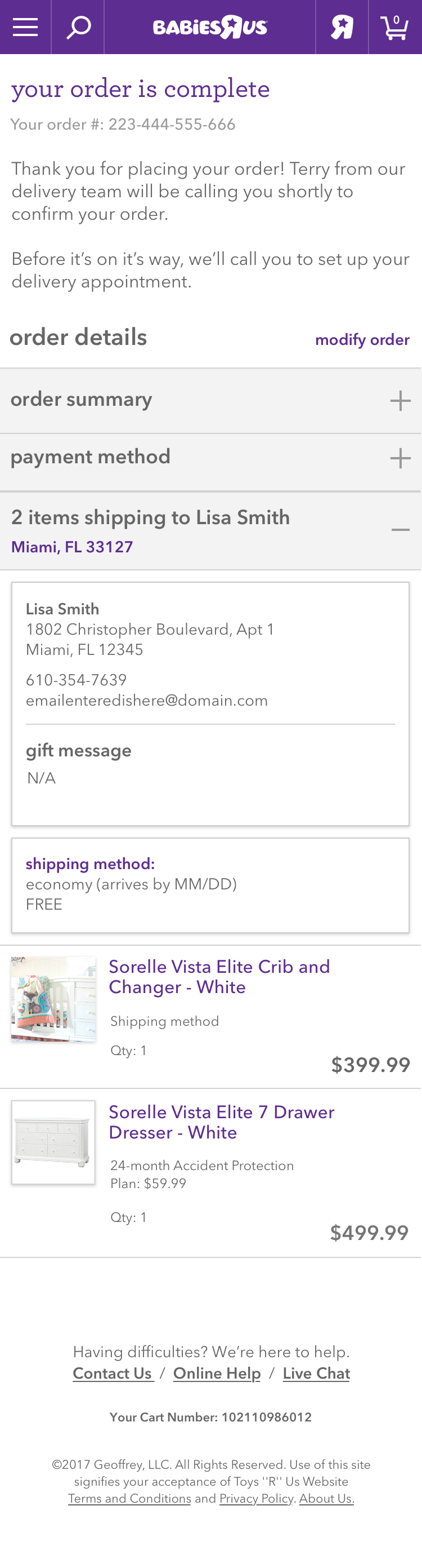
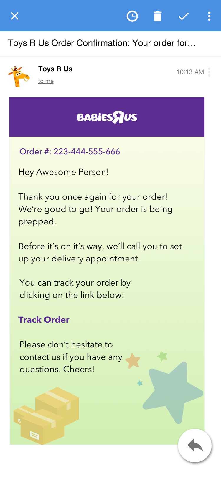
- Send a simulated order confirmation email with a tracking link, along with an updated order tracking page.
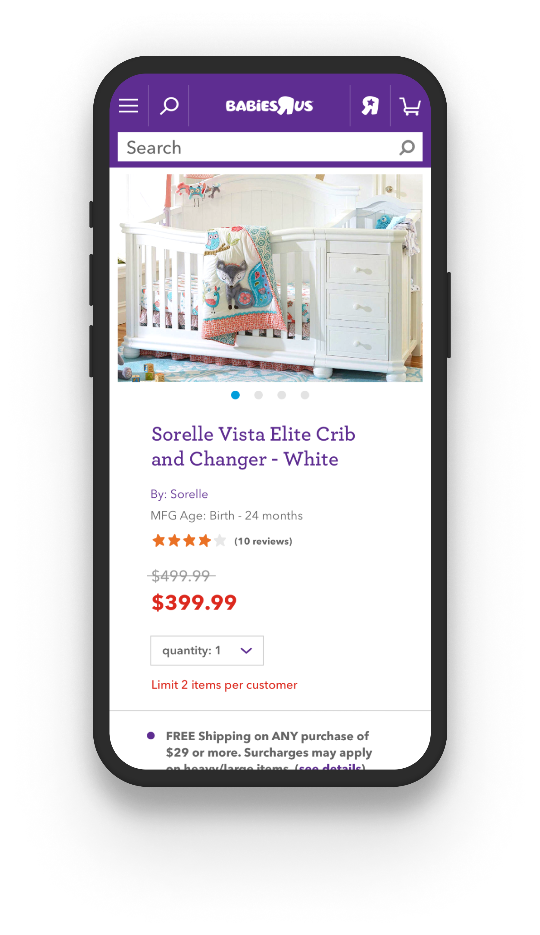
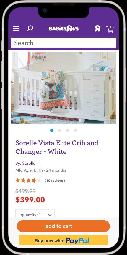
Screens from the prototype and a screen grab from the user test
Testing
After trying to make a simple prototype using Sketch and Invision, it became clear that we needed something more robust for our prototype. I created an Axure prototype that would:
- Store and update a user’s choice as they shopped and chose a shipping option, even if they changed their mind and choose a differently priced option
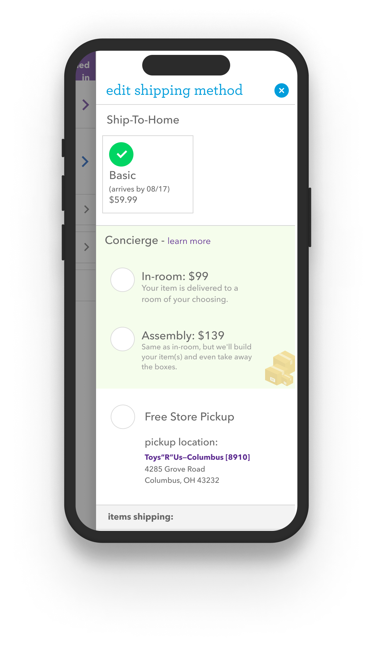
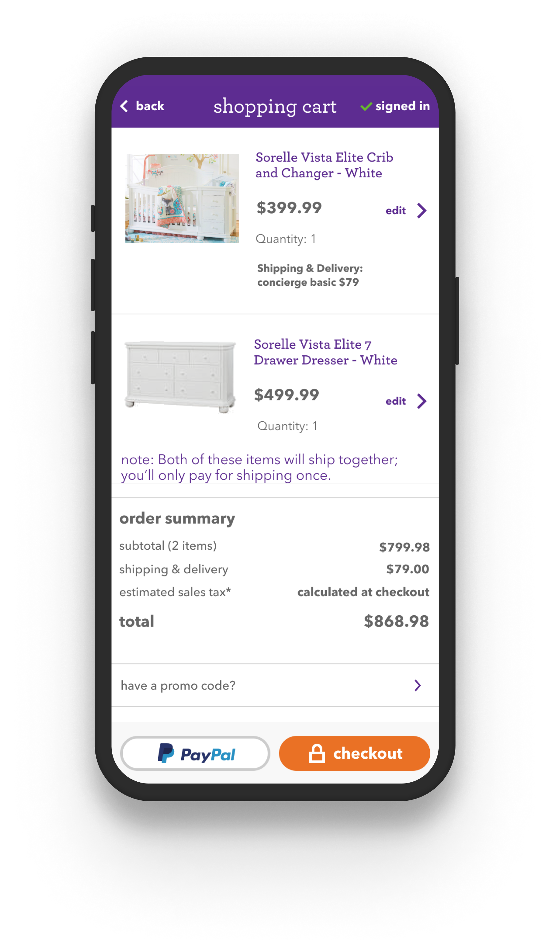
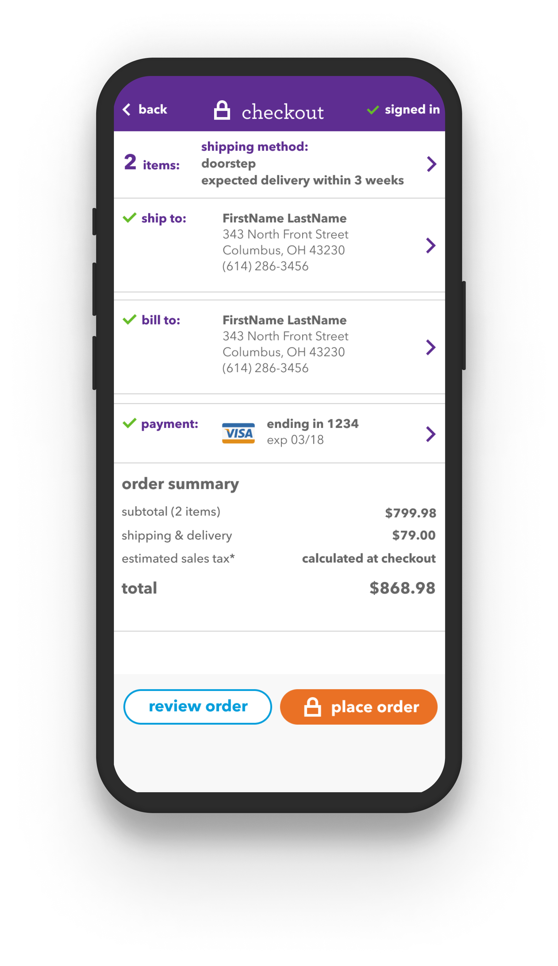
- Show minimum modification to the product page, cart and checkout pages, with the exception of the order summary, estimated taxes and final pricing
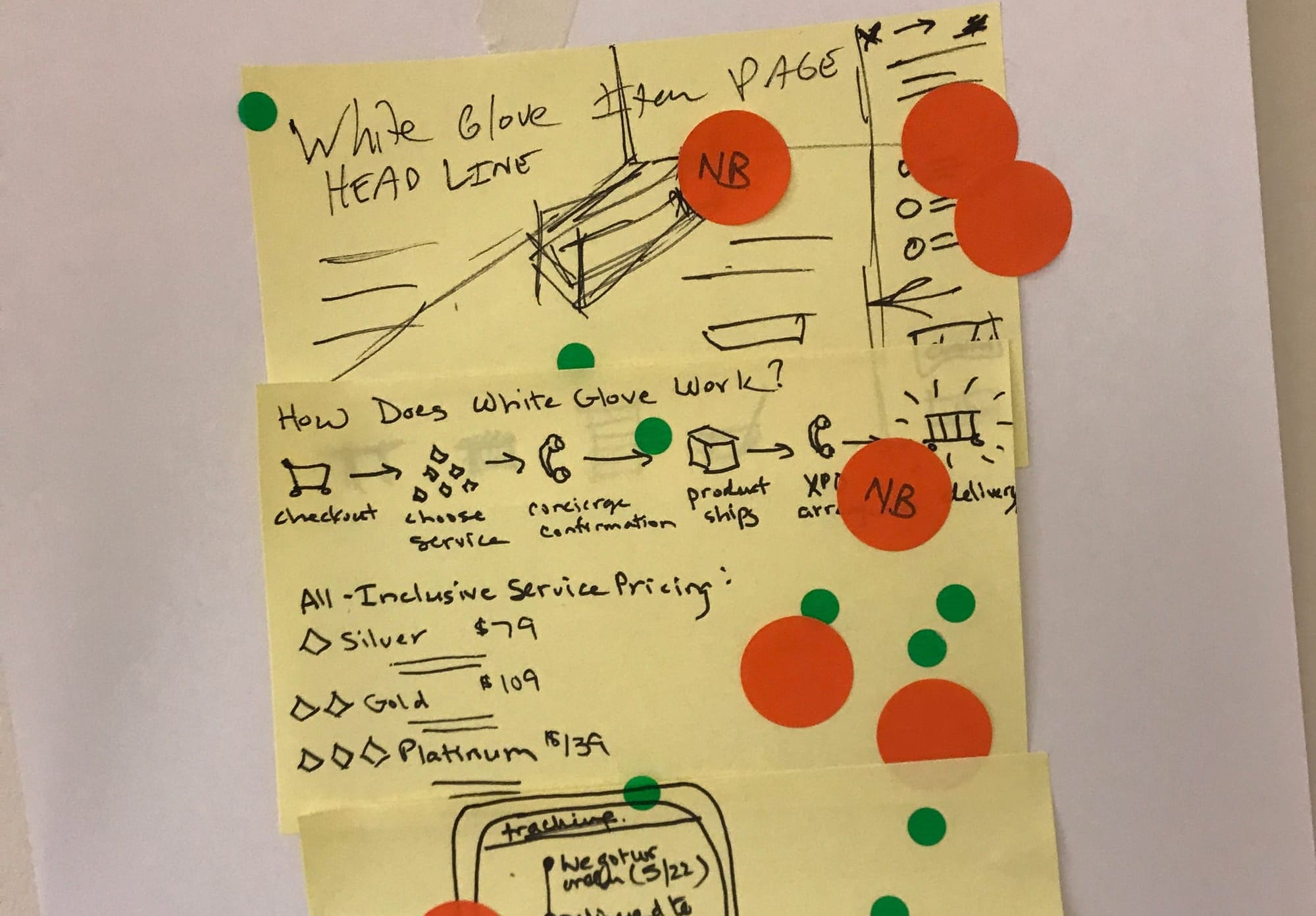
- The group felt very strongly that we needed an explainer modal, but because this was mobile-only, that mean a very long scroll; the group didn’t care about the scroll length, just that the service experience and pricing tiers were explained
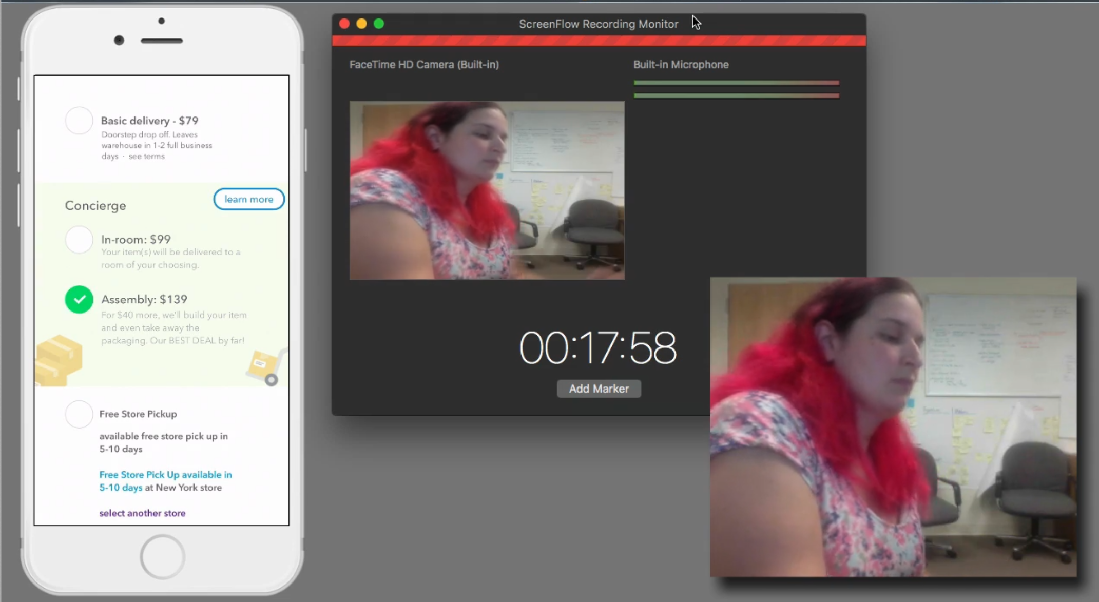
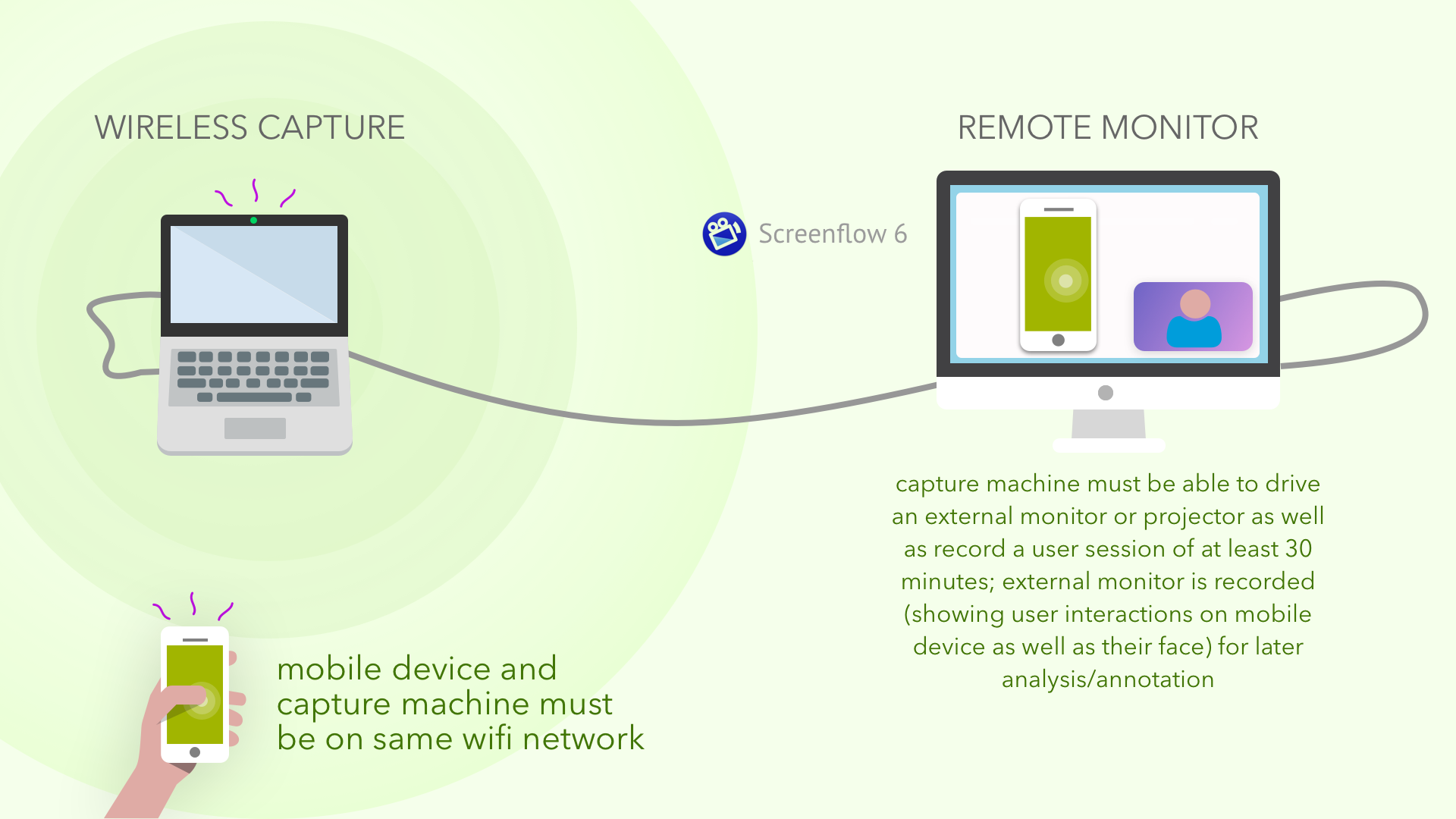
The test was conducted with participants drawn from an internal group of customers who had opted-in to a user test group. The test needed to display and record the phone screen in real-time as the participant scrolled, tapped and talked their way through the test. We also wanted to record the users facial reactions as well as their responses to the design and questions the moderator would be asking.
Setup for the test
I was able to find tools that would allow me to use a laptop to capture and broadcast both the webcam capture and the test phone running the Axure prototype, record the moderators voice, the participant’s reaction & voice and send a composite video of everything to an observation room.
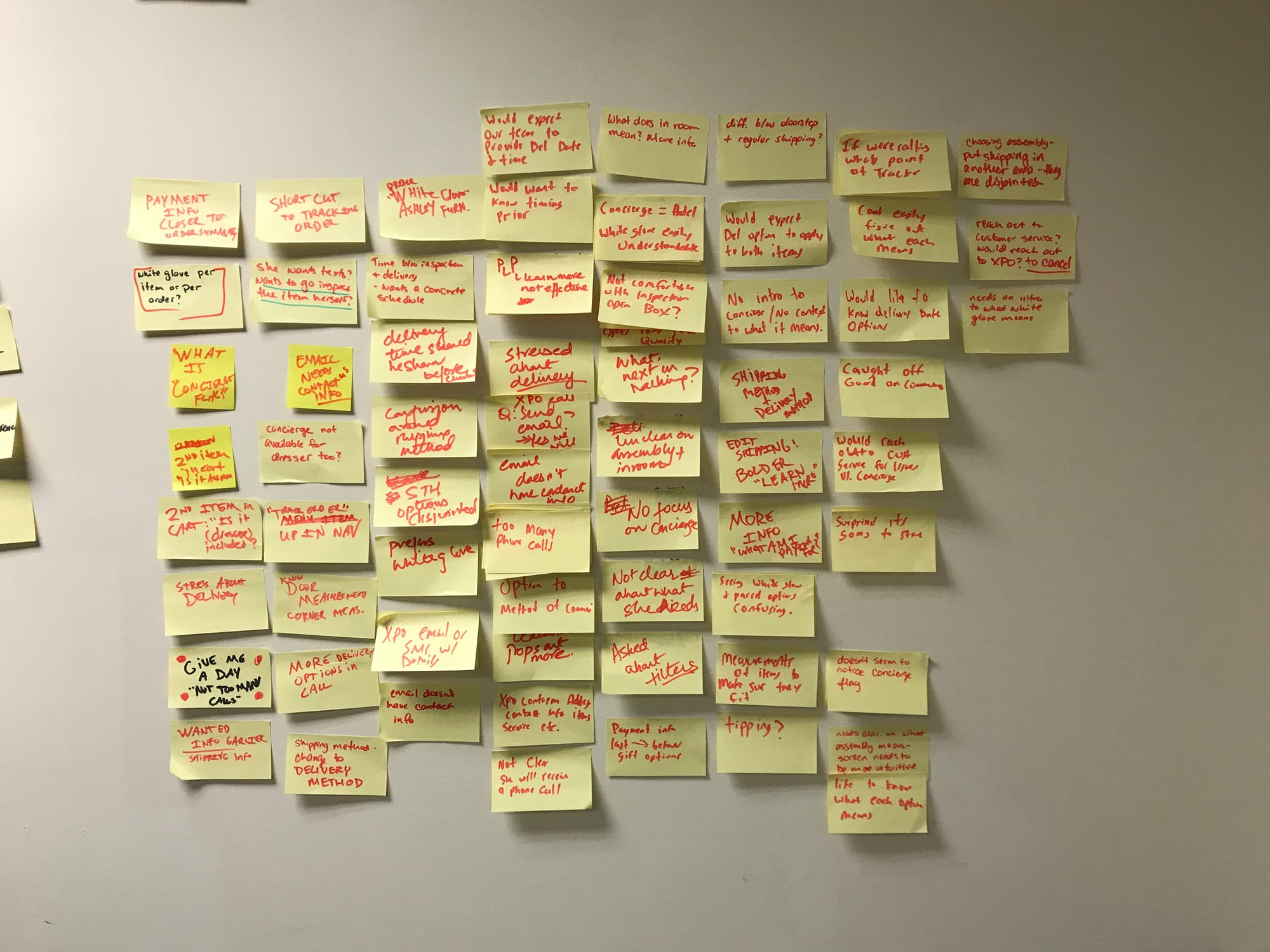
Results & Findings
- We used “White Glove” and “Concierge” when talking about the service; participants overwhelmingly preferred “Concierge”.
- Explainer page was never tapped by a participant unless urged to explore by the moderator; the internal hand-wringing about user confusion didn’t bear out and a simpler explainer modal would suffice.
- Value shoppers felt they would either pay for porch drop off or just pay extra to have the furniture built. Participants shared that there were far more expensive assembly costs from other stores.
- Key finding: the middle tier could be scrapped as most participants said that the basic delivery or full assembly would be their preference.
- Because the existing experience customer complaints and reviews were so terrible, the company was willing to keep the assembly price the same regardless of how many items needed to be assembled; when informed of this, users suggested this should be a bigger marketing point as that would both encourage additional purchases and encourage paying for the top tier.
Outcomes
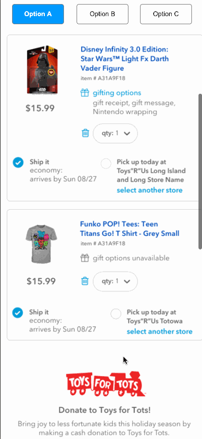
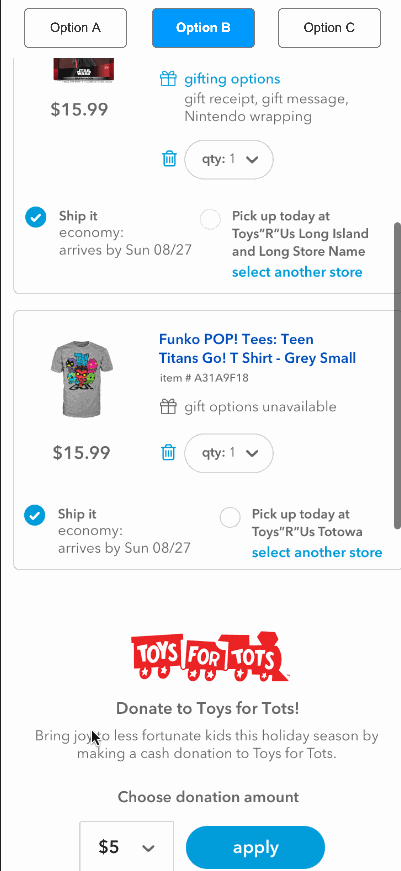
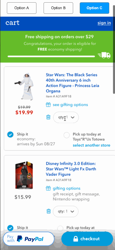
Following the moderated user tests, there was an internal debate over what users would prefer when it came to cart and checkout buttons to advance to the next step. The product owner wanted us to have persistent buttons. I wanted to have buttons that only appeared once a user scrolled far enough down the screen so that the buttons wouldn't block any content. We also added a test with inline buttons. I designed three different tests with new groups of users seeing a different Option A, B, and C for each of the three tests. It looked something like this:
A = buttons sliding in and out as a user scrolls down the screen;
B = inline buttons appearing at a set position;
C = persistent buttons that are always visible
Test two
A = persistent buttons that are always visible
B = buttons sliding in and out as a user scrolls down the screen;
C = inline buttons appearing at a set position
Test three
A = inline buttons appearing at a set position;
B = persistent buttons that are always visible;
C = buttons sliding in and out as a user scrolls down the screen
The goal with this approach was to eliminate or reduce primacy/recency bias enough to get reliable qualitative results.
The script prompted them to scroll in the shopping cart and notice the checkout buttons. We then asked for their feedback as well as for them to choose their favorite. Here are GIFs showing Option A, B and C:
Magic buttons
This option has the checkout buttons showing only once a user got to a certain point on the screen and then hiding if the user scrolls up. This was controversial and the user response was surprising. The younger users preferred this, but older users felt that it just added noise.
Tried and true
This option shows inline buttons. This was by far the most preferred button placement/functionality and it surprised the product owner and my boss. This was what went to production.
Product Owner's best friend
Persistent checkout buttons. This was my least favorite and after the results were in, it was liked only marginally better than the move in/out buttons by respondents with most users preferring tried and true inline buttons.
Epilogue
A couple of months after we performed the user tests, the company filed for Chapter 11 and we were unable to implement the concierge service. Even so, the time from initial workshop sessions, screen designs and prototype build to final user tests and debrief was 3 weeks. This test was one of my favorite end to end design, test and report out I’ve ever done. It felt renegade and new, even though the methodology was straightforward. Stakeholders really felt involved and engaged with the user tests and their buy in was the quickest I've ever seen. Having a voice in the design process goes a long way to mitigate stakeholder concerns.
Prototype converted to Figma, including variables for cart subtotal, checkout estimated tax: